
Client
“I want something colorful and jolly like my macarons, with a touch of delicacy using a soft palette.”
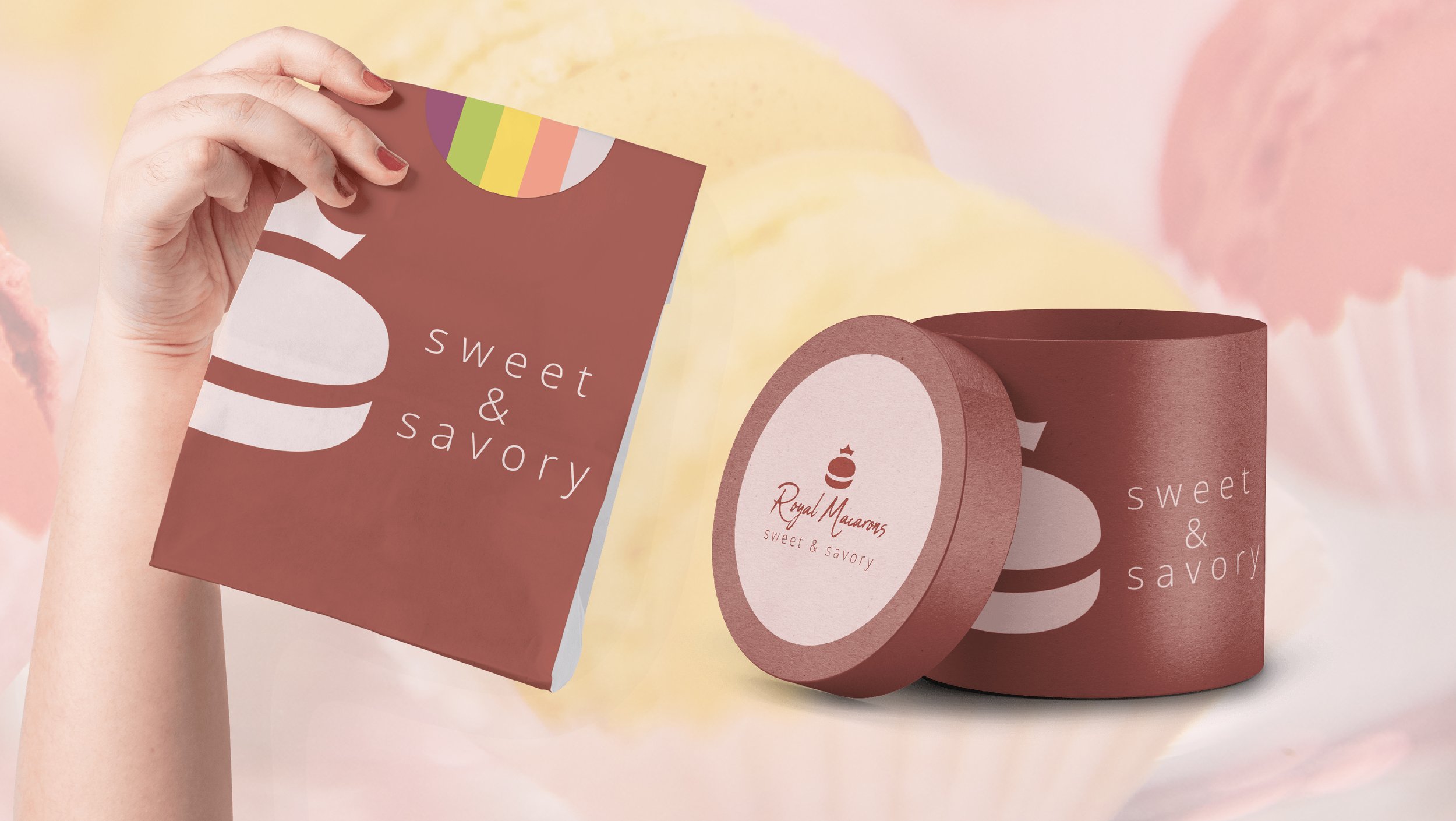
This was a fun and succinct logo and visual identity. The logo is simple yet bold – easier said than done – and the brand font is classic, friendly and enticing. Their brand line is “sweet & savory” for which I chose a simple lowercase font which could be carried through to all designs and communications.
Burgundy was the main color for the brand to play into the regal feel, but I wanted to make the whole look and feel of the brand more fun and approachable and so introduced a secondary color palette based on the various flavors of macaroons.
For Business Cards, rather than a formulaic rectangle design, I decided to do something more playful and create a series of circular macaron shaped cards based on the brand’s flavors.

Duality Poster Series
I created a playful poster series based on the idea of ‘duality’. This brought together different constructs which the brand and product stood for, while introducing the different brand colors.

sharing & caring
sharing & caring

Having developed packaging and menus, the brand announced a partnership with a local coffee house. Knowing the brand’s playful belief of bringing things together, as seen in their line “sweet & savory”, I designed a fun packaging approach that brought together the two elements of the partnership, macarons and coffee, as well as the idea of bringing two people together.

